One research-backed design language for every Truist digital experience — a year-plus effort, now in finalization.
Role & context
Design lead. I led a team of four designers reimagining the digital design language behind Truist.com — work I kicked off side-of-desk in 2025 and have driven from research through a documented system (v2.2), now in its final stage.
The challenge
Across six digital platforms, Truist's experiences had drifted apart. Competing type scales, inconsistent color use, and one-off component patterns made things hard to find, harder to scan, and visually incoherent. There was no shared foundation teams could build on.
The approach
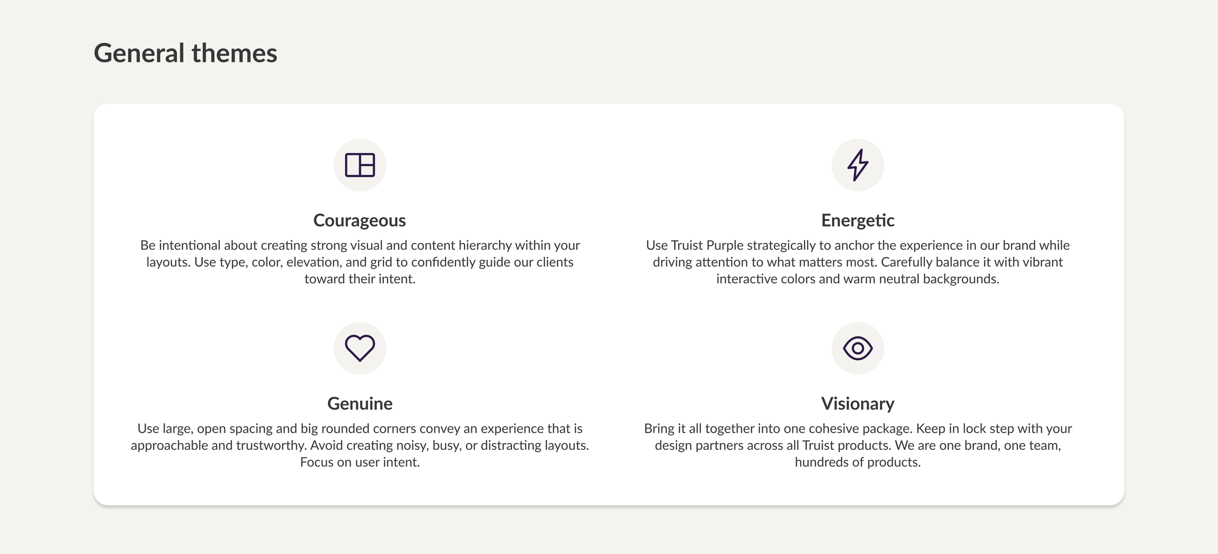
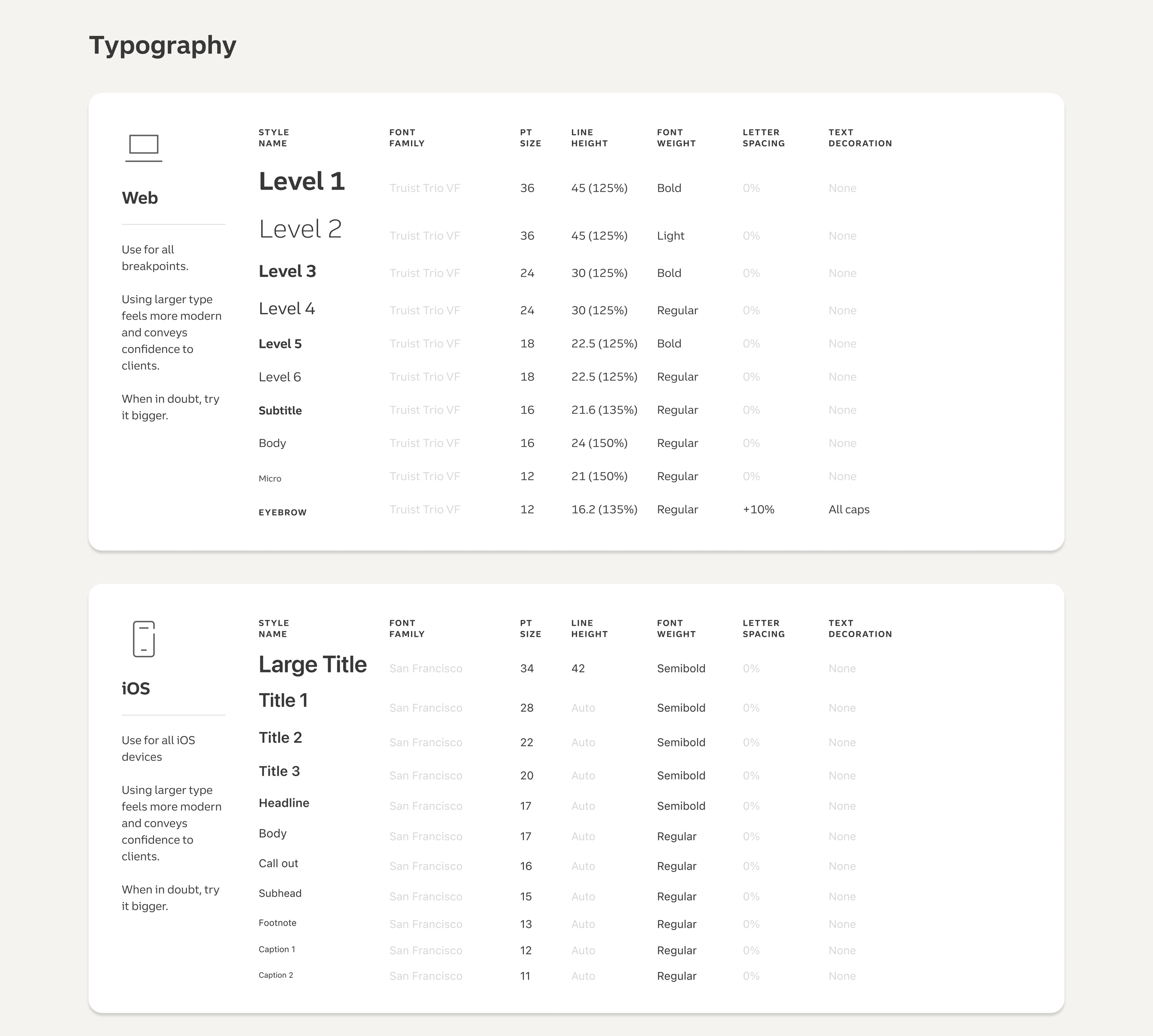
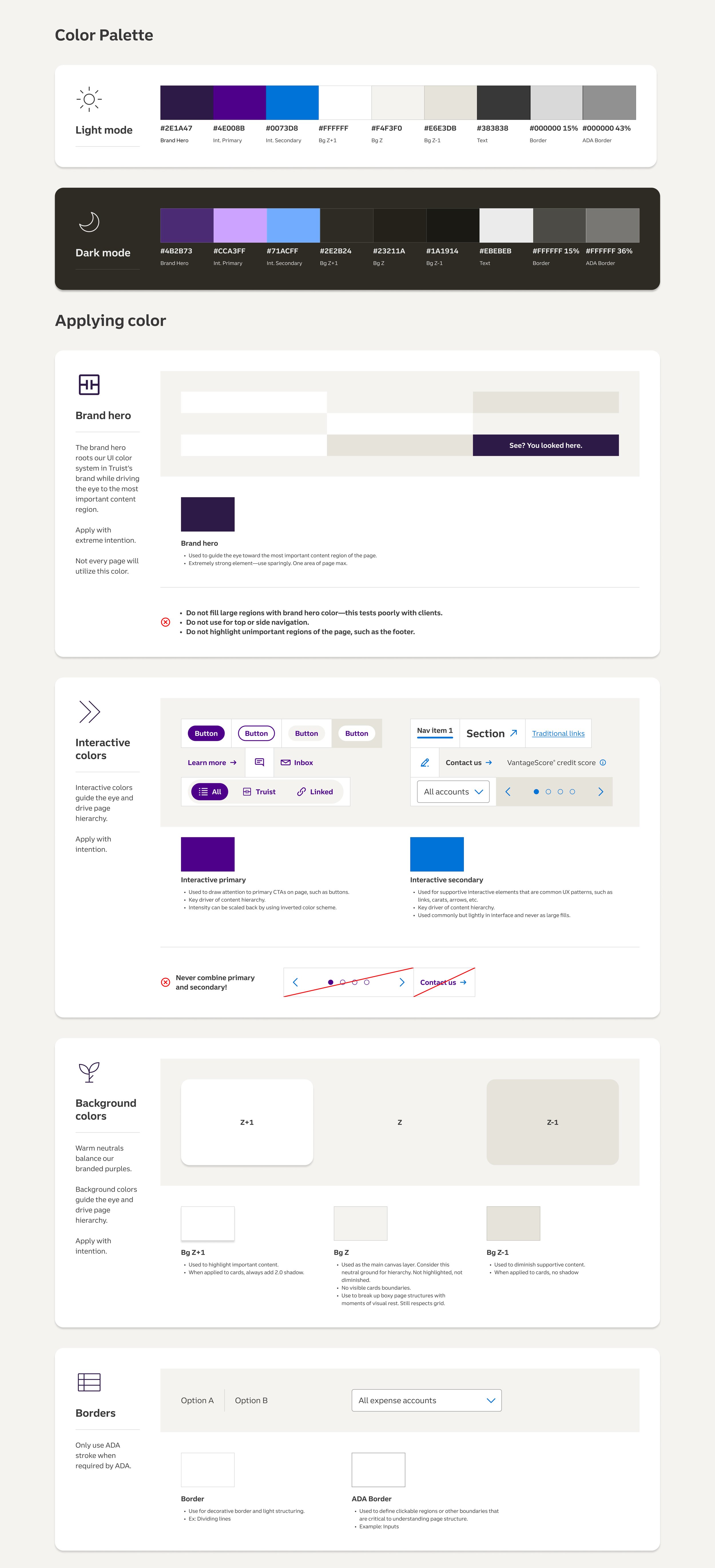
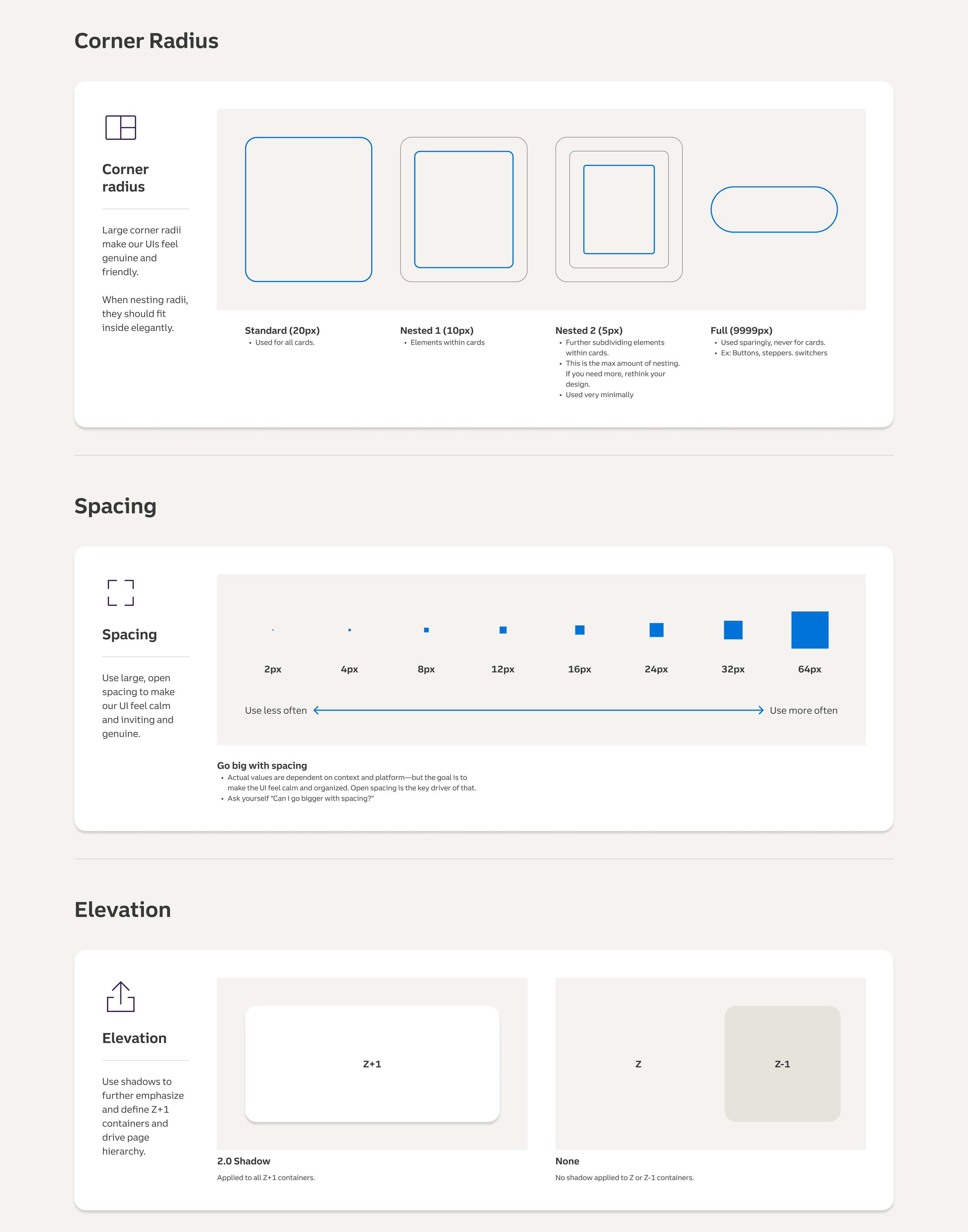
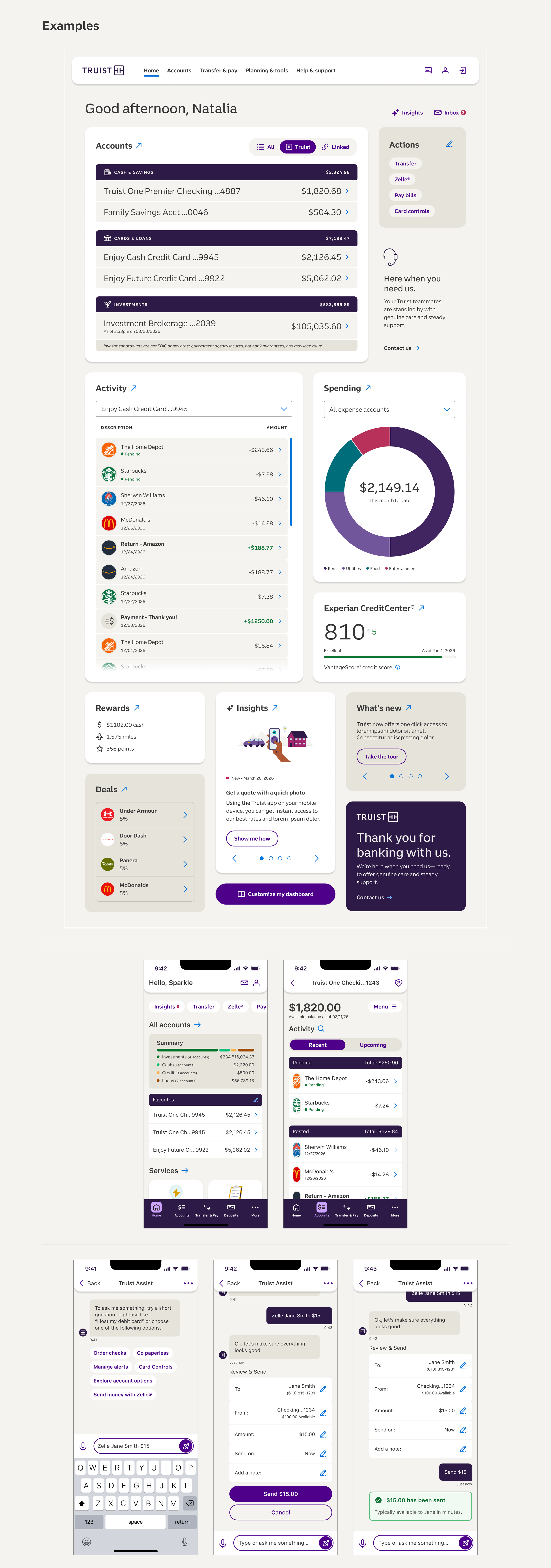
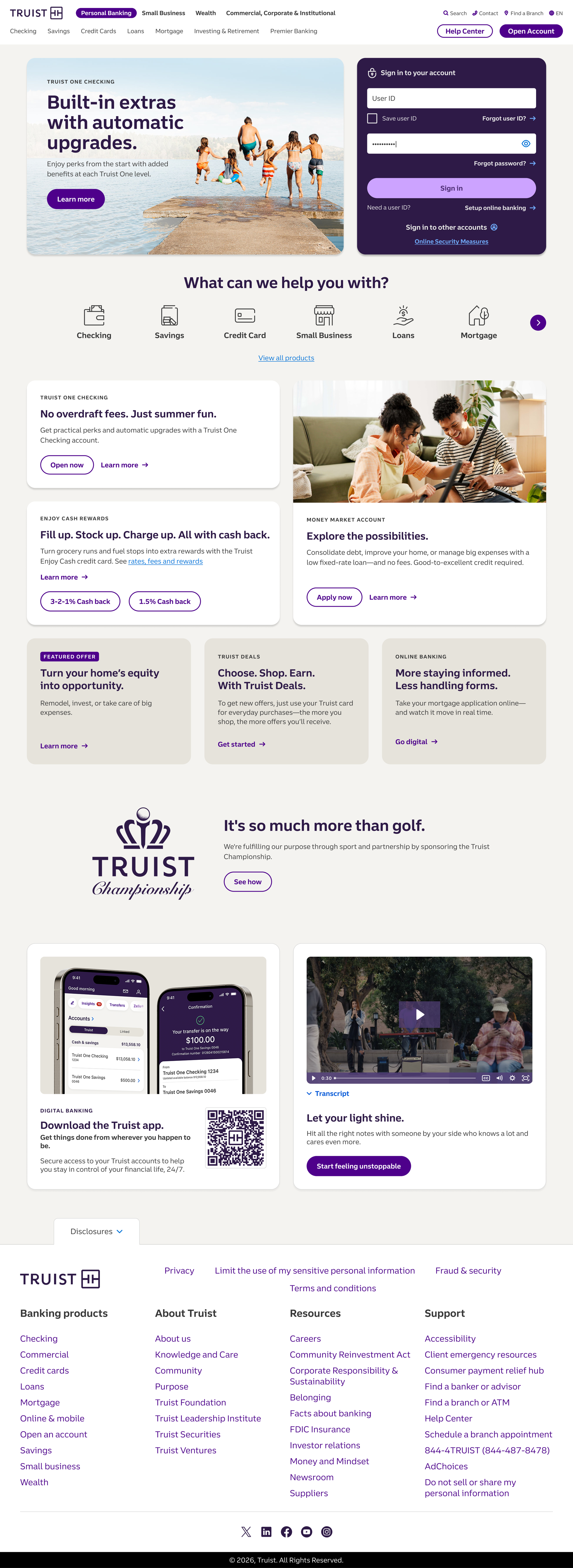
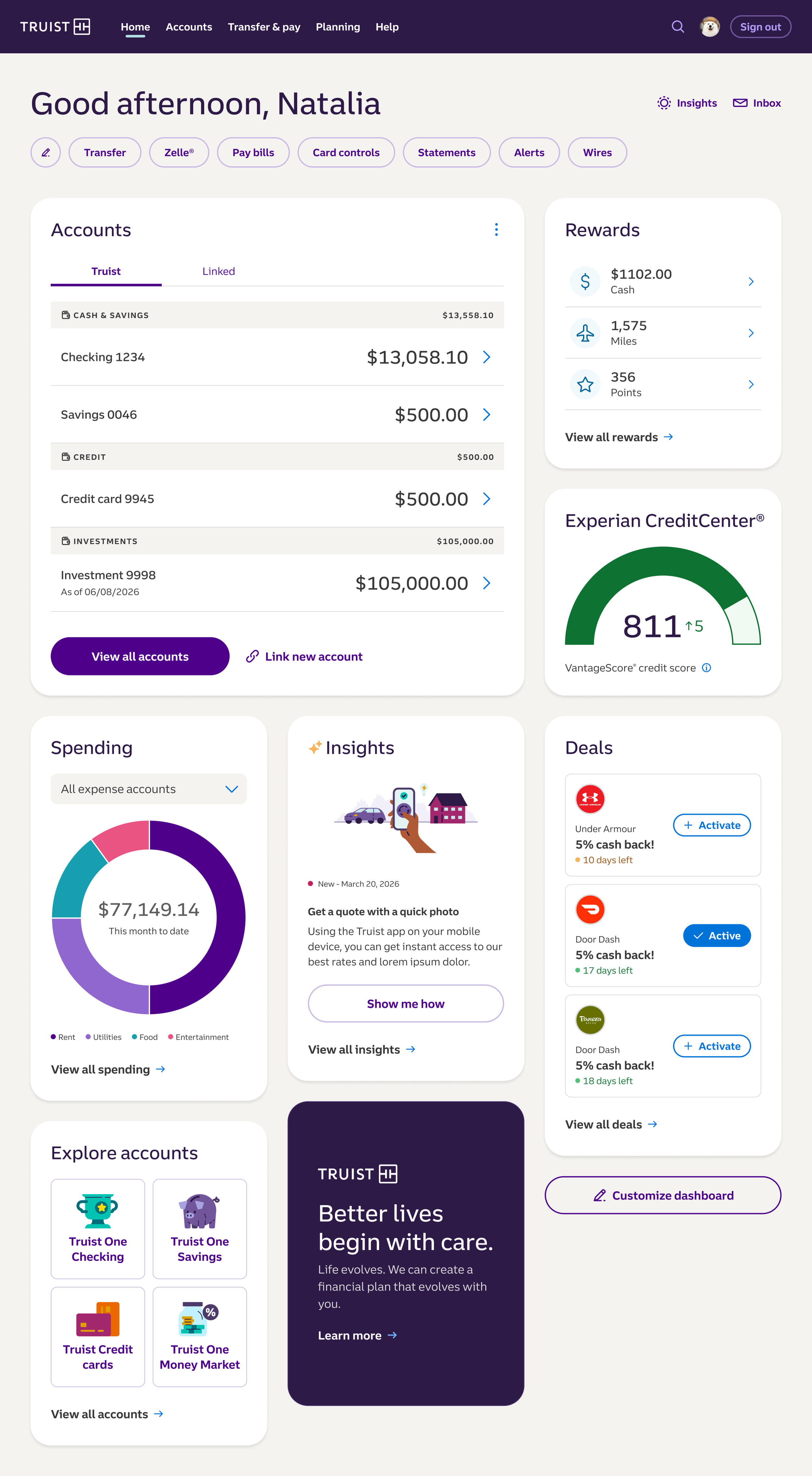
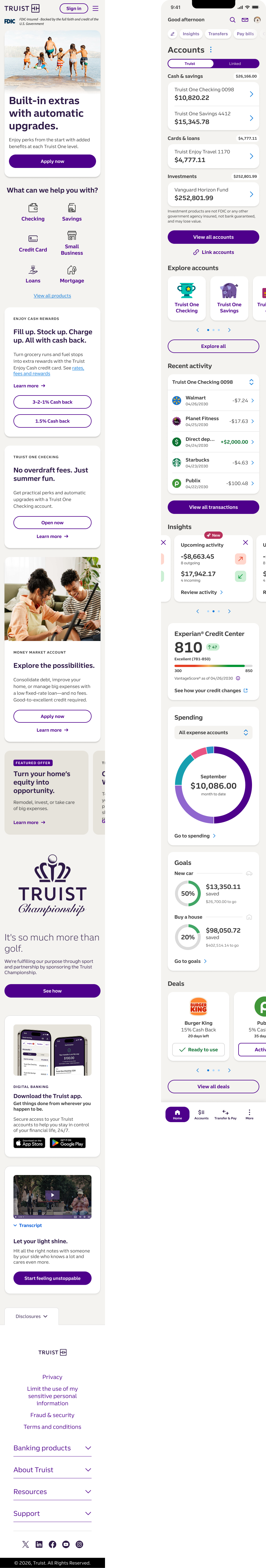
I grounded the work in evidence before design: researched 1,000+ live screens to map the real state of the system, then explored 20 concept directions before converging on one. From there I defined the foundations end to end — themes, web and iOS typography, light and dark color palettes, rules for applying color, borders, corner radius, spacing, and elevation — and pressure-tested them against real product surfaces, from account dashboards to mobile flows.
Key design decisions
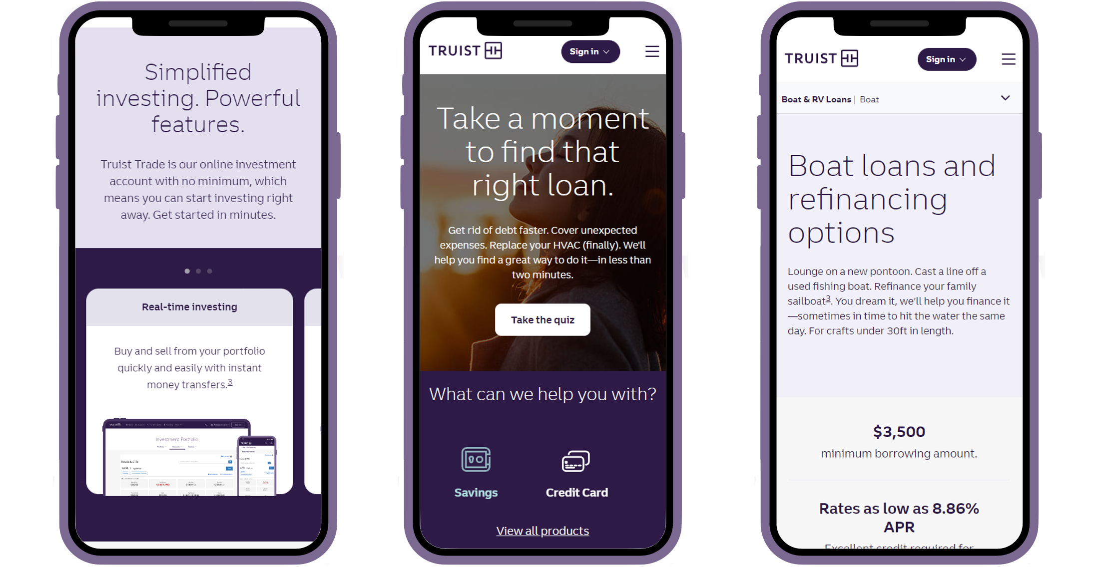
Making the Truist brand color show up better was a priority of the evolution, and a few deliberate moves got us there. I introduced a more vibrant, brand-forward interactive color plus a secondary blue interactive color, sharpening findability and visual hierarchy by making actions unmistakable. I also shifted the page background from a cool grey to a warm off-white, a complementary base that pushes elements forward and lets the Truist purple read far more powerfully across the site.
The outcome
Truist Design Language v2.2, now finalizing: a single documented system that gives every team a shared, accessible foundation and tightens visual and content hierarchy, findability, and usability across platforms.
Skills: Design systems · Design leadership · UX research · Color & interaction design · Visual & content hierarchy · Cross-platform (web + iOS) · Accessibility (light/dark)